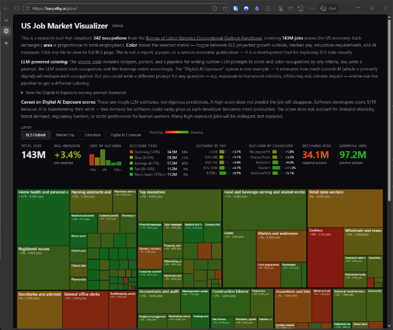
🧭 US Job Market Visualizer: looking at the labor market with data#
This visualizer by Andrej Karpathy shows 342 occupations in the U.S. labor market as a treemap, combining employment, pay, education, and AI exposure.
What stands out#
- 📊 143 million jobs
- 🎨 Color by different metrics
- 🤖 AI exposure scoring
- 🔎 Explore occupations with official data
The nice part is that it’s not a static report: it’s a tool to explore how work could change under different lenses.
🪄 Quick explanation#
Think of it as a map of jobs.
Each tile is an occupation, and the color helps you see how it behaves across pay, education, or AI exposure.
👉 Useful for understanding which jobs may change the most.
More information at the link 👇
Also published on LinkedIn.